
A calm colour palette for a child’s wardrobe
Neutrals, accents, the colour wheel and a simple ratio: how to choose colours that work together, suit the child and look lovely in photographs.
Colour is the first thing anyone notices about an outfit and often the last thing anyone plans. Yet a calm, considered palette does more for a child’s wardrobe than any single beautiful piece. It makes clothes easier to combine, keeps the attention on the child rather than on the print and looks lovely in photographs years later. Here is how to build one, with a short detour through the history of pink and blue.
Begin with neutrals
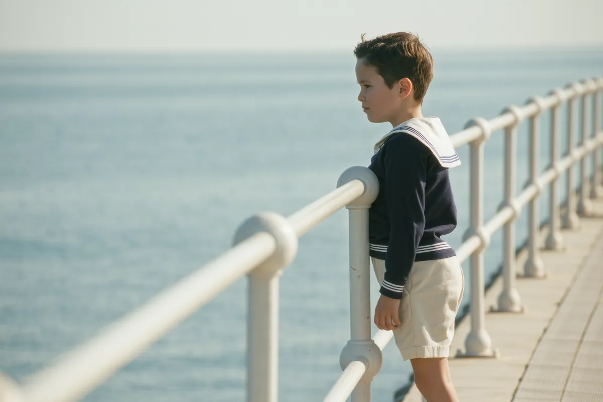
Neutrals are the foundation of any calm palette, because they mix with almost everything. Ivory, oatmeal, camel, navy and grey all work well for children. Navy deserves a special mention as a softer alternative to black: it grounds an outfit in much the same way, without the severity.
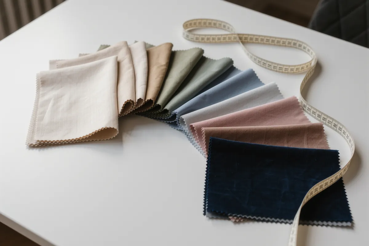
Natural materials add another quiet layer. Natural dyes and undyed fibres, such as linen or undyed wool, give muted, harmonious tones that sit easily beside one another. A wardrobe built on these shades rarely produces an outfit that clashes.
Neutrals also make hand-me-downs easier. A navy coat or an oatmeal jumper sits as comfortably in next year’s palette as in this one, whoever wears it next.
The colour wheel, simply explained
The colour wheel arranges colours in a circle, and two relationships on it are especially useful. sit opposite each other, such as blue and orange. sit next to each other, such as blue, blue green and green.
Each relationship has its own mood. Analogous schemes look calm, because the colours are closely related. Complementary schemes look lively. For a calm wardrobe, analogous combinations are a reliable starting point: a pale blue shirt, blue green trousers and a soft green cardigan, for example. Complementary pairings are best used sparingly, as a small and deliberate accent.
A simple ratio for every outfit
Once the colours are chosen, proportion does the rest. A useful ratio for outfits is often described as roughly 60 per cent dominant colour, 30 per cent secondary colour and 10 per cent accent. It is a guide rather than a law, but it explains why some outfits feel settled and others restless.
- Dominant, about 60 per cent: navy trousers and a navy cardigan
- Secondary, about 30 per cent: an ivory shirt
- Accent, about 10 per cent: a rust hat or a pair of coloured socks
In a child’s wardrobe the dominant colour is usually a neutral, the secondary colour a lighter neutral or a soft tone, and the accent a colour with a little more life. Choosing that accent is a lovely decision to share with your child.
The ratio also helps when a child has a bold favourite. A bright colour does not need to be avoided; it simply works best in a smaller dose, as the accent in a hat, a scarf or a pair of socks, surrounded by calm neutrals.
How colour looks in photographs
Clothes chosen for a celebration end up in photographs, and colour shapes how those pictures feel. Very bright, colours can dominate a child’s face in photographs. Softer tones keep the attention where it belongs, on the child.
For family pictures, it helps to choose two or three related shades for everyone rather than identical outfits. The image then looks harmonious without looking staged, and each person still looks like themselves.
White, pink and blue: a short history
In the nineteenth century, most babies and toddlers, boys and girls alike, wore white dresses. Part of the reason was practical: white cotton could be boiled and bleached.
The idea that pink is for girls and blue is for boys is younger than many people assume. The historian Jo B. Paoletti showed in her book Pink and Blue: Telling the Boys from the Girls in America (2012) that this fixed rule only became firmly established in the mid twentieth century. Earlier advice varied.
A calm, considered palette does more for a child’s wardrobe than any single beautiful piece.
Knowing this history is freeing. Colours carry no fixed rules for children’s clothes, and a palette can be chosen for the child in front of you: the shades that suit them, that they enjoy and that work together.
Putting the palette together
A palette is easiest to build in a few unhurried steps, ideally before the next season’s shopping begins.
- Choose two or three neutrals as the base, for example navy, oatmeal and ivory.
- Add one or two accent colours that sit well beside those neutrals.
- Check every new piece against the palette before you buy it.
- Use the 60, 30, 10 guide to balance each outfit.
A palette is not a uniform. It simply gives every new piece a place to belong, so that the wardrobe grows calmer, not busier, with each season.
Glossary
- Complementary colours
- Colours opposite each other on the colour wheel, such as blue and orange; together they look lively.
- Analogous colours
- Colours next to each other on the colour wheel, such as blue, blue green and green; together they look calm.
- Saturated
- Describes a colour at full intensity, with no grey or white mixed in.
- Ecru
- The pale, greyish yellow shade of unbleached or undyed natural fibres such as linen.
Questions and answers
Is black a good colour for children’s clothes?
Black is not forbidden, but navy is often the gentler choice. It works as a softer alternative to black for children and grounds an outfit in much the same way. Navy also mixes with almost every other neutral, from ivory and oatmeal to camel and grey, which makes it one of the most useful colours in a child’s wardrobe.
How many colours should a child’s wardrobe have?
A calm wardrobe works well with two or three neutral base colours, for example navy, ivory, camel or grey, plus one or two accent colours. That is enough for variety and few enough that almost every piece combines with the others. Within each outfit, the rough guide of 60 per cent dominant colour, 30 per cent secondary colour and 10 per cent accent keeps things balanced.
Which colours work best for family photographs?
Softer tones usually work best, because very bright, saturated colours can dominate a child’s face in photographs. Choose two or three related shades for the whole family, such as ivory, oatmeal and soft blue, rather than identical outfits. The picture will look harmonious, and the attention stays on the people in it rather than on their clothes.